I’ve often mentioned the ‘big twinkie’ that is mobile and/or responsive design, and the dramatic changes that wave is making on not only user interfaces, but how users interact with them.
For as long as we’ve had websites, the one thing you could always count on being questioned about in a review is “how many clicks does the user have to do?”. It’s as if everyone read the CliffsNotes on UI/UX and that one little nugget was all anyone came away with.
A page could literally have 45 links across the top making it unusable, but as long as the user didn’t have too many clicks to get to what they want, it’s all good. Their thinking completely ignores the Rule of Seven, which is one of the fundamental cornerstones of human interaction, but hey ‘it’s only a click away’, right? Who cares if the human using it can’t decipher or remember all of the options, they are only a click away.
It’s far time we got rid of this long outdated and overused concept when looking at a user interface, or considering the user experience. It has literally become a crutch for people to use instead of making tough decisions. Not entirely sure which of the 15 “Absolutely Must have” navigation items to move? Say, “how many clicks will it take the user?” and the room hushes, and you have a navigation based on a misconception that has persisted for far too long.
I love to read. Imagine if editors applied this same logic. I can see an editor sitting across from Charles Dickens…
“It was the best of times, it was the worst of times, it was the age of wisdom, it was the age of foolishness, it was the epoch of belief, it was the epoch of incredulity, it was the season of Light, it was the season of Darkness, …”
That’s a great start Charlie, but we have all these pages before we get to it…
“It is a far, far better thing that I do, than I have ever done; it is a far, far better rest that I go to than I have ever known.”
I think the users would like to get to the end with just 1-click.
The problems with this approach are now pretty obvious: this 1-click mentality has us jumping to the end of a story at the expense of our users.
Yes, there are numerous studies that state that for every click the user has to make, 10% of the users leave. I contend, this stat is based on some falsehoods that should be questioned.
Now, don’t get me wrong, I am not condoning some 22-click process, but there is a middle ground that we must be willing to accept.
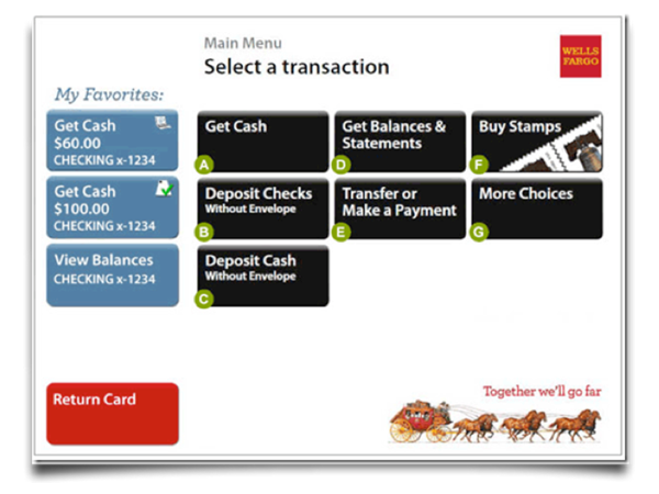
Think about some other things in your life that require an interaction with an interface. Now which of those should have a speedy, fast, and successful user experience? Your ATM is a great example.
Most banks go out of their way to promote using their ATM because it cuts down on overhead. Now, with something so efficient that they’re pushing customers to use it, they most certainly don’t want them taking forever to make a transaction. Banks want volume AND speed, right? So why does a typical ATM interface only present users with a handful of options?

Notice there are only 10 options. However, customers can easily perform every action that a bank’s website allows them to do from this simple ATM interface. Now, of all places, shouldn’t the bank worry about “how many clicks is it going to take the user?”. They are, no doubt, but they’ve also taken into account the confusion that more choices creates. So, they’ve cleaned up the user interface and added a few more clicks in order to guarantee a solid, successful user experience. This approach to design delivers a faster user interaction and gets more users through the ATM experience. Adding a few more clicks didn’t ruin the experience, nor did it cause someone to stare at the screen for 5 minutes trying to decipher what they were supposed to do.
It’s about time we focused on helping the user succeed and forget about how many clicks it takes them. The number of clicks has nothing to do with a user’s ability to successfully complete complex interactions. I will say it again:
The number of clicks has NOTHING to do with a user’s ability to successfully complete complex interactions.
Any user interface is a story with a beginning, a middle, and an end. This 1-click mentality has us jumping to the end of a story at the expense of our users. Instead of asking “How many clicks does the user have to do?”, sit down and work out a user’s work flow. Write the user story, storyboard the process, find your “best of times” … and know where your “far better thing” is, but don’t forget the revolution that takes place in-between those two… THAT is where your user’s success or failure really lives.

